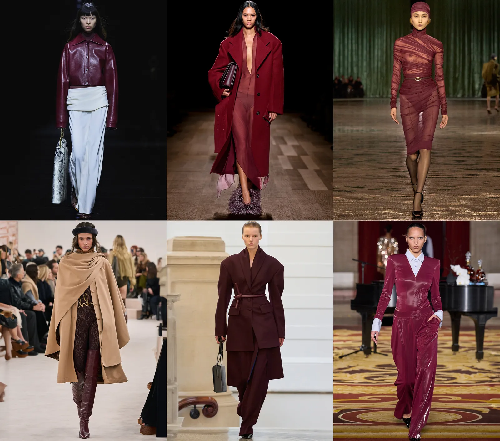
Burgundy, a dynamic and dramatic color, continues to make its mark across both fashion and interior design landscapes. Its rich intensity has captivated designers and fashion enthusiasts alike, making notable appearances during top fashion week street style events. As Jane Lockhart, a renowned designer, notes, burgundy speaks of intensity and drama, making it a versatile choice for various applications.
The shade’s dominance is evident as it graces the streets in head-to-toe ensembles or serves as an accent alongside neutrals and dusty pastels. Fashion expert Emma highlights burgundy’s practicality as a seasonal investment, adding sophistication and a touch of luxury to any wardrobe or interior. The deep color value of burgundy lends it a naturally luxurious and historic feel, according to Fanny Abbes, contributing to its continued popularity in design.
In interiors, burgundy can stand alone as a moody color or be paired creatively with others for unique effects. Fanny Abbes suggests pairing it with terracotta for a monochromatic look or using the two tones to offset each other, creating vibrant spaces. Julia Mack emphasizes the striking contrast achieved when burgundy is combined with off-white, while Hannah Yeo recommends pairing it with pale blues like ‘Silver Mist’ or ‘Yarmouth Blue’ for added balance and sophistication.
Layering burgundy with varied textures such as tweed, houndstooth, or shag rugs enhances the depth of a space, as Julia advises. Experimentation with different paint finishes, from matte to glossy, can also introduce visual interest, notes Hannah. The 60-30-10 rule, involving a triadic scheme of dominant, secondary, and accent colors, can feature burgundy to create a color-rich interior, according to Emma.
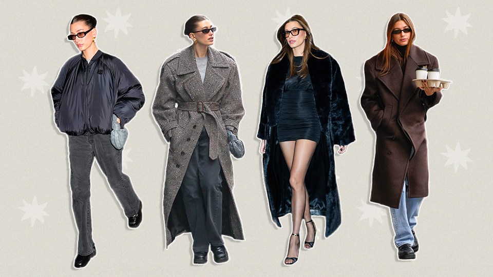
Featured image courtesy of Vogue

Leave a Reply